Article
Digital Design 101: Things To Keep in Mind When Designing Your First Product
Designing your first digital product can be difficult. Learn what you need to keep in mind to deliver digital interfaces users will love and hit your ROI goals.
As consumer demands change, so must products. Decades ago, the brands making pressure cookers, for example, never had to consider also designing a digital interface for their product. Now they’re expected to weave digital touchpoints into the device itself and build interfaces (like apps) to support its use.
The companies that have mastered physical product design may find themselves up a creek without a paddle when it comes to the unique rules, best practices, and considerations for UI/UX design.
This is not to say you should slap a screen on any product just for the sake of it. The choice to incorporate a digital interface into your product should be deeply considered and always in service of your users. Once you feel confident that a rich digital UI is the way forward, here are a few pointers to ensure that bridging the gap between physical and digital products goes off without a hitch.
1. Be Open-Minded (But Still Discerning) When Evaluating Design Inspiration
Designers will usually kick off the process by putting together mood boards (i.e. digital or physical collages of design elements like colors, fonts, illustrations, patterns and more) for your team to react to so you can actively participate in the design process.
You probably have some initial ideas about what you want your new digital product to look like. Maybe you want to communicate a particular tone or personality — e.g. sleek and futuristic or friendly and welcoming. Perhaps you’re planning to iterate on an existing design or tap into features trending in your market. Whatever the case, you should totally bring all of these ideas to the table. However, it’s important to approach the design process with an open mind and a healthy dose of skepticism.
Look at Design Inspiration with a Critical Eye
UI/UX designers often peruse trade publications and scroll sites like Dribbble, Behance, and Awwwards to find inspiration for their designs. We might even borrow inspiration from fashion, architecture, and the art world — anything to get our creative juices flowing.
As you’re reviewing this inspiration via mood boards, remember that not all design inspiration is relevant to your product. What works well for one product or industry might not be a good fit for yours. The designer’s job is to push the envelope of creativity, so sometimes they may show you options that are eye-catching and trendy, but may not actually be practical for your product.
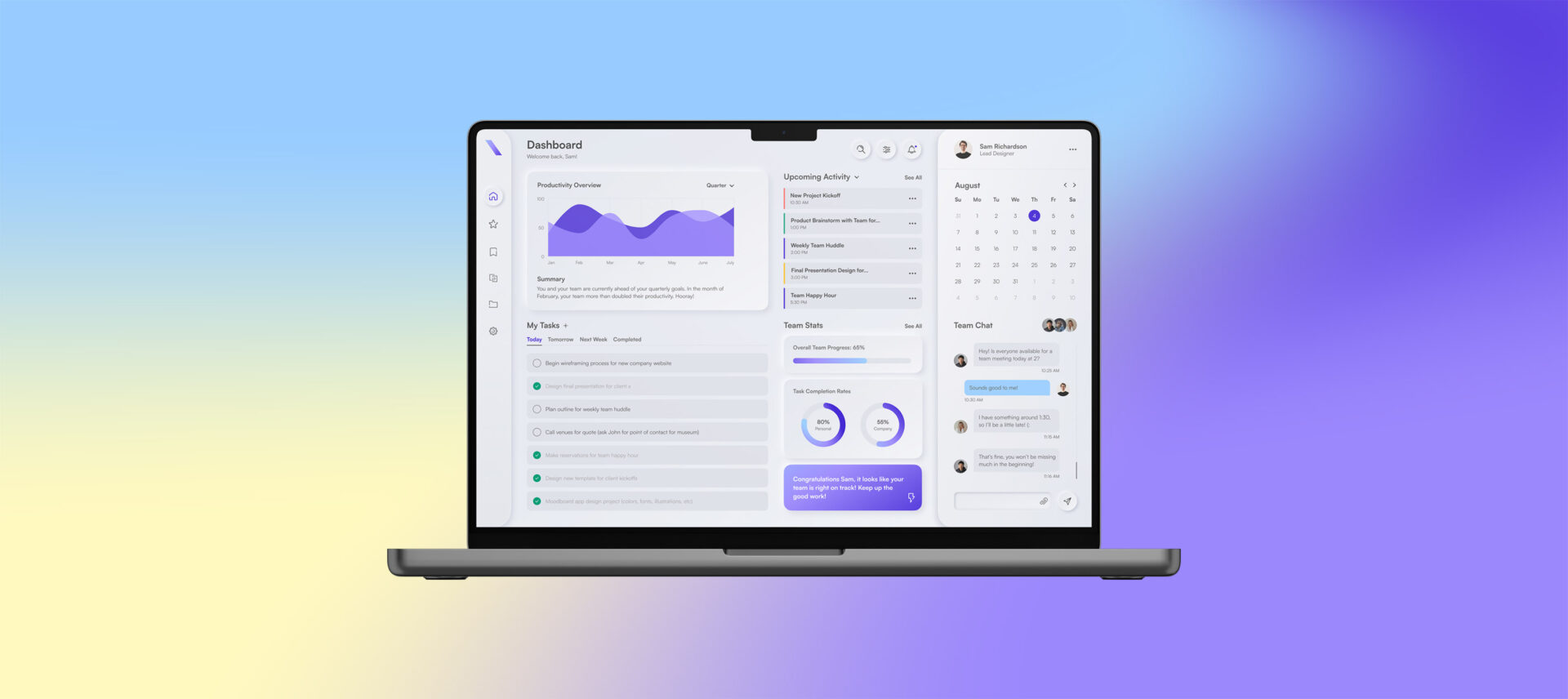
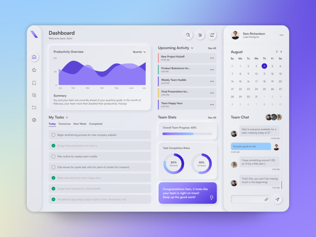
For example, in the last few years, Neumorphism (a style that uses blur effects, shadows, and highlights to create a futuristic, extremely clean, and realistic appearance as shown below) has exploded and has been featured on every inspiration platform. Designers have used this trend to create incredibly sleek, beautiful designs to showcase their skills and creativity. Unfortunately, despite its aesthetic look, it’s not the most practical from an accessibility, usability, or development perspective. This low-contrast, mostly monochromatic look increases the risk of:
- An unintuitive, frustrating user experience
- Users completely missing the subtle design elements due to visual impairment or low-quality screens
- Developers hating you for overly complicating their jobs

Lastly, remember that no matter how much you may love what your designer presents in a mood board, avoid becoming overly attached to one particular idea at this stage of the process. Mood boards showcase your product’s design potential, but they’re only a starting point. In the prototyping phase, designers may find that a concept doesn’t function the way they thought it would, and your final design can easily deviate from the initial concept – usually for the better.
Stay flexible and open as things change. And be aware that sometimes arriving at the right result means letting go of a concept you love.
2. Keep the User at the Forefront of Your Product’s Design
If you’re developing a product that includes a digital user interface, there’s definitely no lack of design options and trends to choose from. As such, it’s all too easy to get caught up in the beauty of a design without stopping to consider whether it will truly meet your users’ needs.
Ask the following questions in order to make sure your product is user-centered at its core.
Is the Design Accessible?
It can be easy to overemphasize the look and feel of a user interface, which is understandable — that’s where all the fun and creativity happens. But the way the UI is designed can also impact the user’s experience. And that’s particularly true from an accessibility standpoint.

Here are just a few things to keep in mind to make sure your product’s interface is accessible:
- Legible fonts. Highly stylized fonts might look appealing to you, but they might be unreadable for users with cognitive impairments or whose first language is different than yours. Also, make sure to set font sizes that promote easy readability.
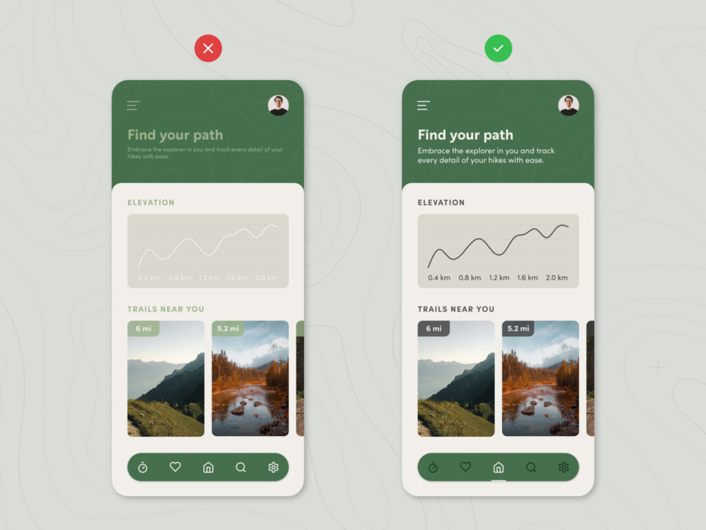
- Color contrast. Weak color contrast can be problematic for people who are color blind or who have other visual impairments. This can affect users’ ability to perceive the information you’re trying to convey through your design.
- Predictable functionality and navigation. Use consistent labeling, information architecture, and design principles to provide users with a predictable, easy-to-use interface.
Designing with accessibility in mind is good for all your users. There are also legal reasons to make this a priority.
Is the Design Intuitive?
Unintuitive interfaces frustrate users and ultimately lead to a bad experience. And when your audience is frustrated, they’re way more likely to abandon your product in favor of one that’s easier to use.
This is true even if your brand is otherwise well respected. For example, I drive a pretty average car in my everyday life and recently had to drive my friend’s high-tech vehicle. I happen to think the company that makes this vehicle is making super interesting moves and is positively impacting the world. But my otherwise very positive view of this brand was tainted by a less-than-ideal driving experience because of their interface design choices.
Basically, this car sets the dashboard controls above the center console instead of the usual spot. This placement made it difficult for me to check my speed as I was uncomfortable taking my eyes off the road. I even had trouble finding the info I was looking for due to the interface’s monochromatic aesthetic. Everything seemed to run together.
This sleek, modern, ultra-minimalist design makes total sense for the brand itself, but is it the best choice for its users? There are plenty of people who’ve made the choice to adjust to this kind of interface and are happy with their experience. But for me, and I imagine many other users, this was a stumbling block.
While this is simply my personal experience, it does point to a larger consideration in design. When you’re making design choices for your product, remember the importance of form and function. Trust me, your users will thank you for it.
3. Stay Focused on Your Product’s Overarching Business Goals
Your product’s design team should continually refer back to your business objectives and user needs to guide every design choice. Staying true to your product’s overarching purpose is the best way to increase your odds of achieving the ROI you expect.
So plan to approach the design process with a clear list of the goals you’re trying to achieve. Share your objectives with your design team early in the process and be sure to reference them every now and then to ensure that you hit the mark.
And remember: Your product does not exist in a vacuum. Sure, you want your product’s design to make a strong first impression that grabs your audience’s attention and immediately distinguishes you from the competition. But you also need to make sure your product is recognizable within the context of your brand’s overarching design language. As such, each element should work in lockstep to convey the overall ethos of your brand. The best designs are part of a cohesive product roadmap that will support your business goals for the long haul.


