dover logo

Removing the stress from a stressful purchase

filling station
The Story

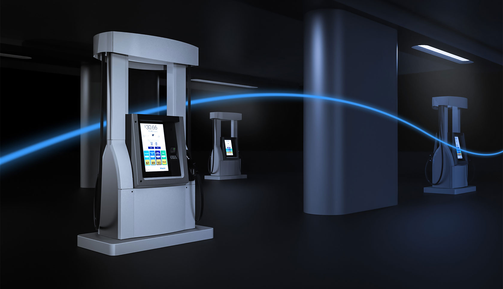
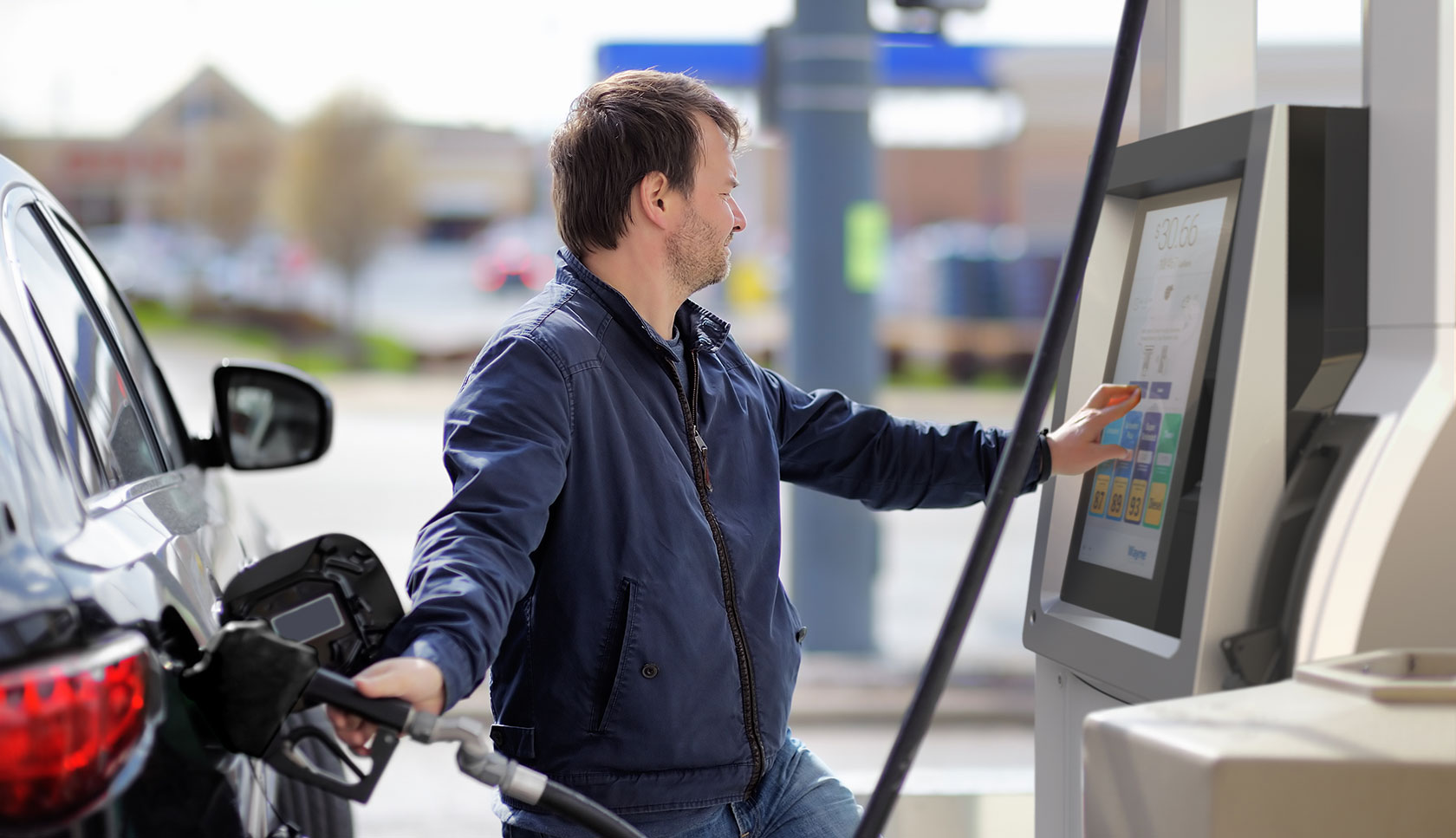
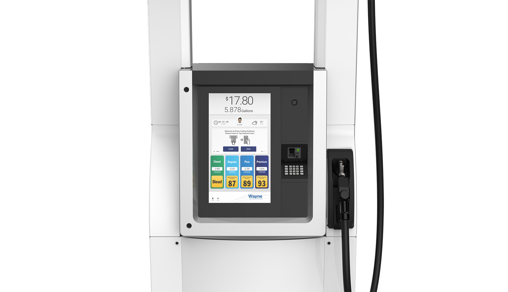
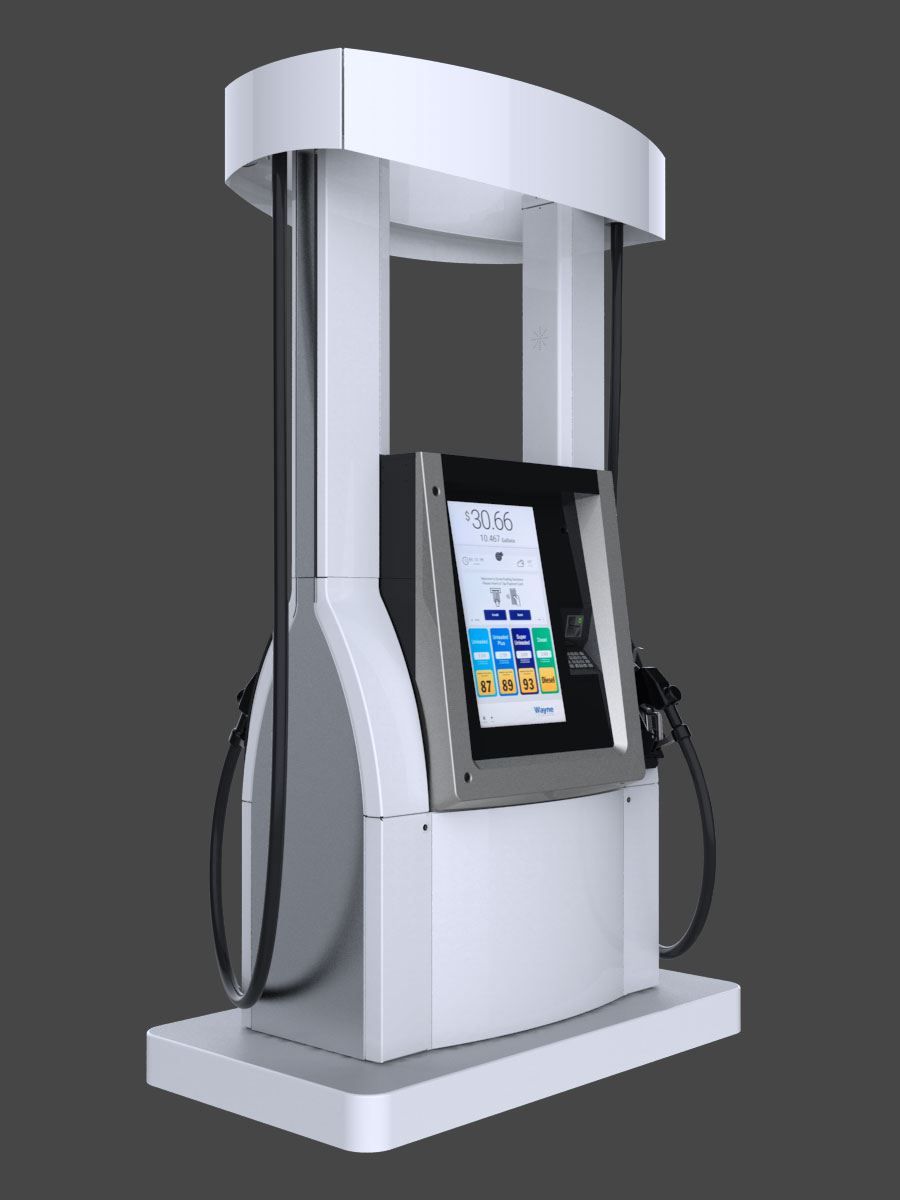
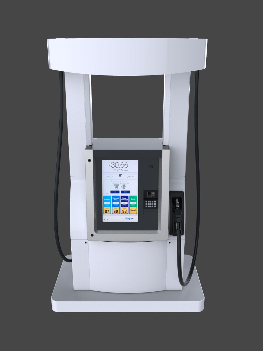
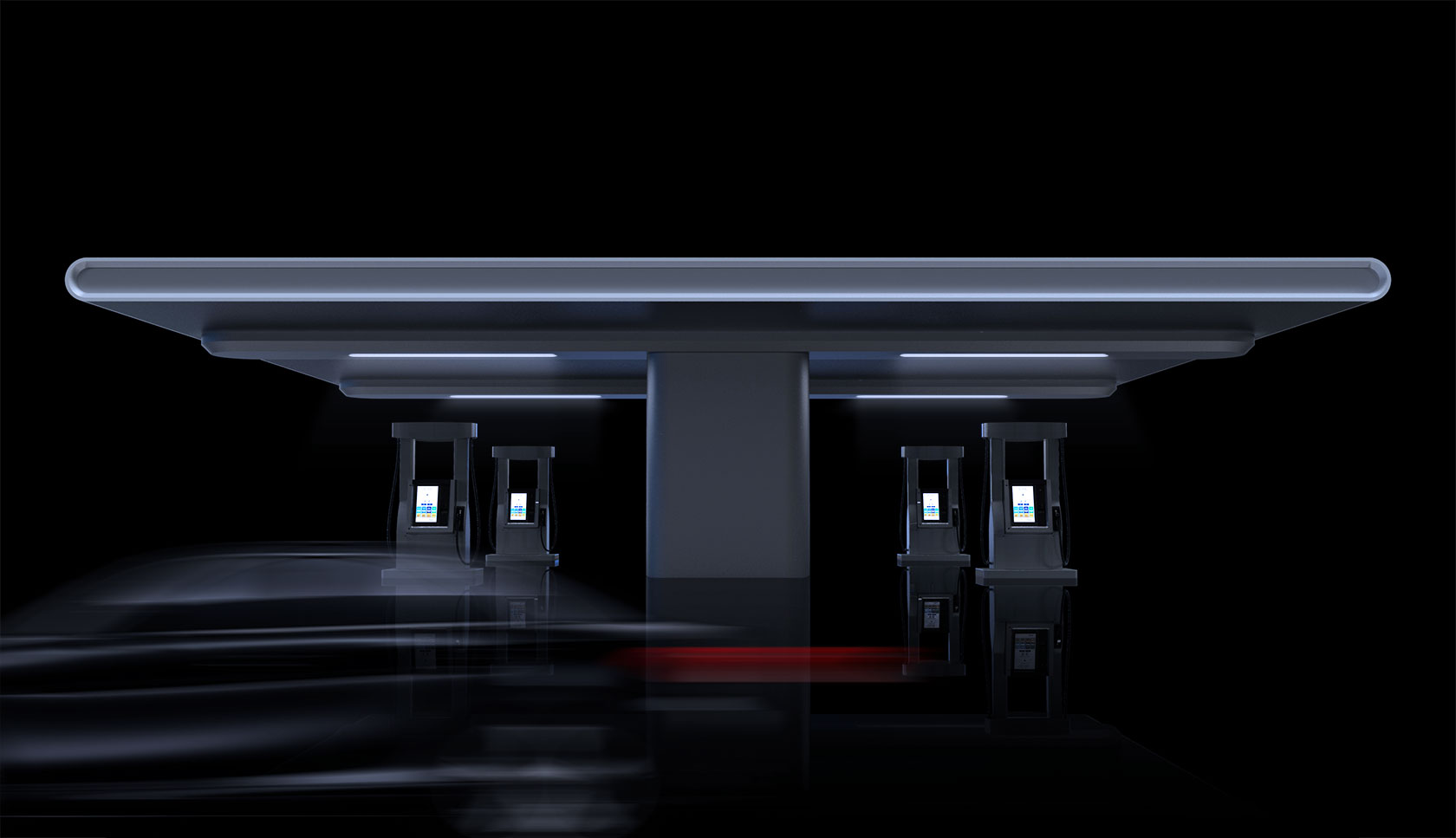
Redefining the fueling experience

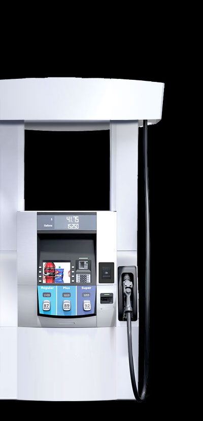
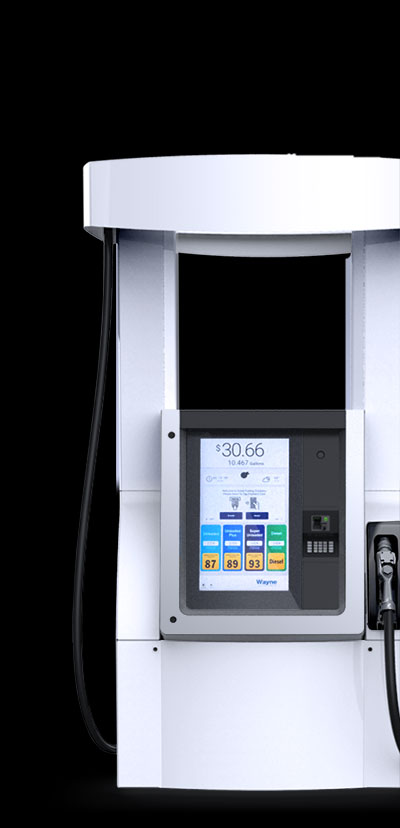
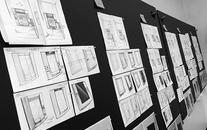
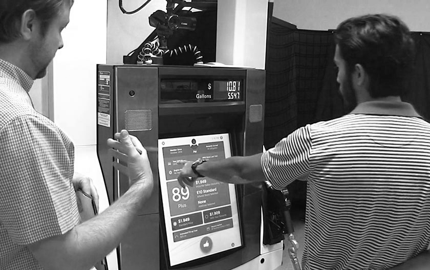
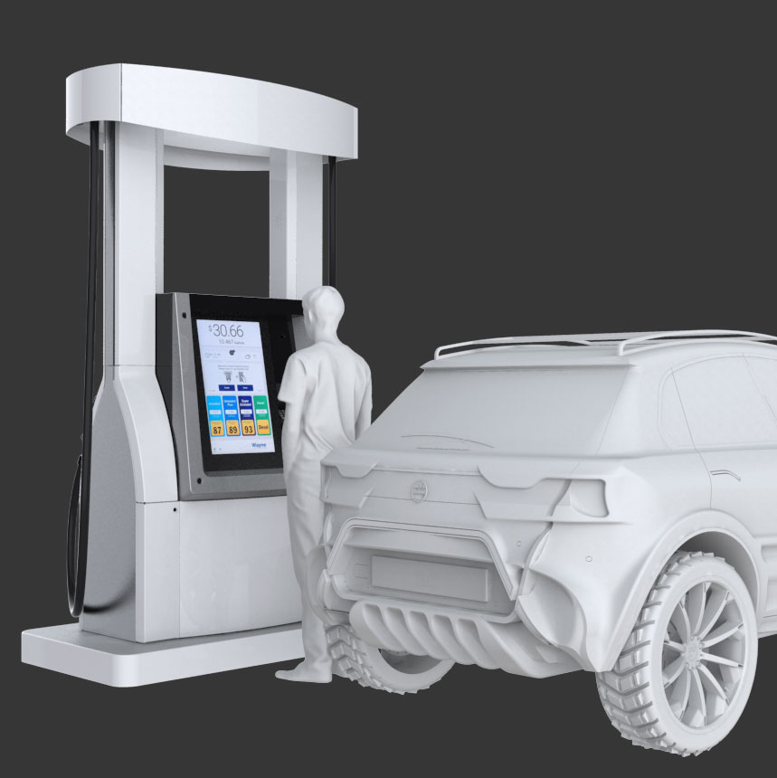
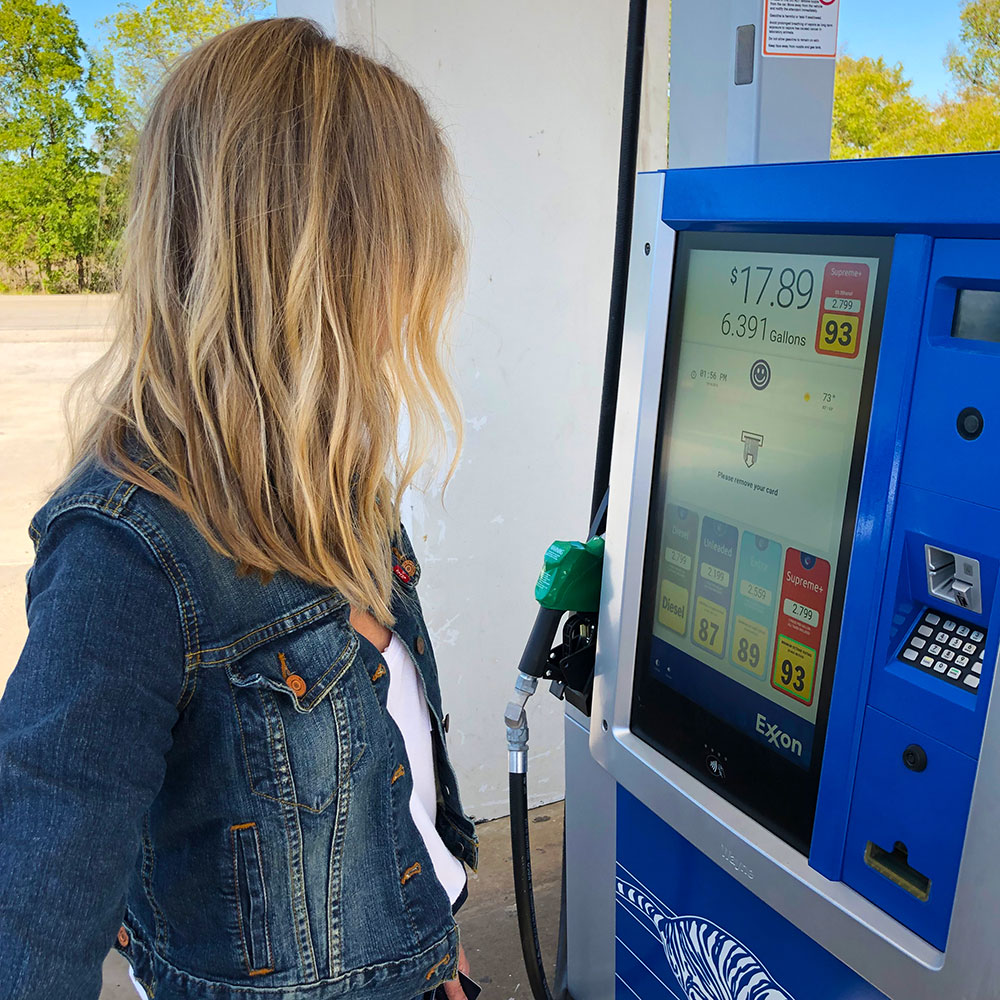
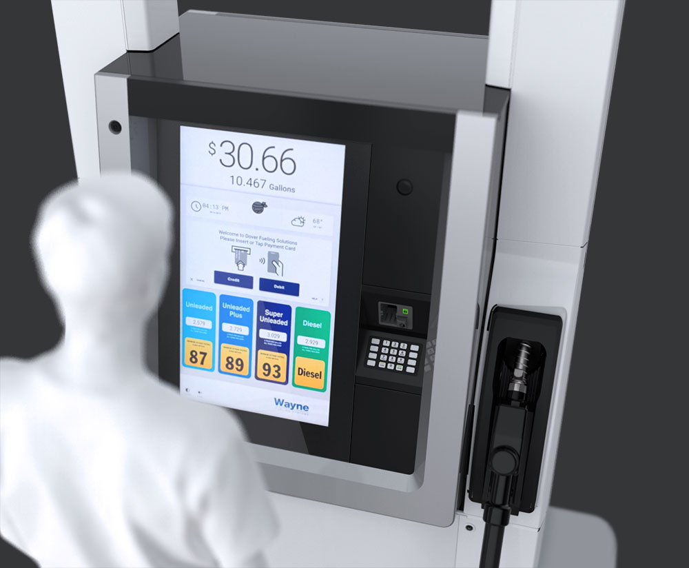
For most users, refueling your vehicle is at best an experience that you don’t think much about. At worst, it is overly complex with numerous buttons, payment options, and on-screen prompts all vying for attention. Dover Fueling Solutions had a proof-of-concept fuel dispenser that aimed to make refueling a pleasant task instead of a headache. The customer was not the only beneficiary – the new dispenser also addressed the needs of station owners. The majority of a fuel station’s revenue comes from in-store purchases, so pushing customers inside was a priority. Dover asked M3 to help refine the design to provide value to both stakeholders.

anthem in a fueling station
man fueling a vehicle
01 02
The Details

Evolution of an Industry Standard

In order to improve acceptance of the new concept, it was critical that the new design fit within the existing electronics housing on Dover’s widely used Ovation dispenser. This allowed for reduced time to market and the possibility of retro-fitting the new interface into existing sites. M3 used customer feedback to optimize the workflow with careful placement of the card reader, pin pad, and other physical touchpoints. The resulting design worked seamlessly with the on-screen interface while providing future-proofed flexibility.

dover anthem front view
Dover anthem front-left
anthem research study
"When we need specialized help to do something innovative, we call M3. And they deliver." John Morris Director, Dispenser Solution Integration at Dover
anthem gui animation
02 02
The Details

Follow the Leader

The dispenser concept followed the example set by the evolution of the smart phone: large touchscreens instead of physical keys. This allows for infinite flexibility in what can be presented to the user, custom GUI skins for each distinct station brand, high-impact advertisements for specialized fuels, a higher number of “soft” fuel selection buttons, and improved usability for customers to input data for paperless transactions. The biggest advantage of the expanded screen footprint is easier navigation through on-screen menus, paving the way for future functionality that allows customers to make in-store purchases during fueling.

anthem dispenser
anthem dispenser
multiple anthem fueling stations

Out With the Old, In With the New

Due to strict regulatory constraints, designing an entirely new dispenser is a heavy time and resource commitment. Dover needed to take a large step forward without abandoning an established market favorite.

ideation effort

Holistic Experience

Usability enhancements were not limited to the on-screen experience – M3 worked diligently to ensure the hardware and digital interface work together harmoniously.

anthem sketching

Visual Continuity

M3 was tasked with incorporating a massive display – the largest Dover had ever used – within the constraints of an iconic form factor while maintaining intuitive placement of payment touchpoints.

anthem prototype testing

Market Acceptance

Technological leaps are welcome in some places more than others. M3 collected in-depth data from customers and station owners/distributors to understand the potential impact of the new interface.

concept of a man fueling at an anthem station
current fueling experience
anthem fueling experience

Contact Us

How can M3 Design accelerate your product development and experience designs?

Let’s Talk